Des Plaines Epoxy Flooring has put more than 20 years into epoxy flooring in Prospect Heights and the rest of our service area, and some of the floors we think hardest about here are not garages at all. They are corridors, dining rooms and resident wings in senior care buildings, where the color of a coating changes how the people walking on it behave.
That is a different brief from a showroom finish. A floor in a dementia care setting has to be read correctly by someone whose visual perception has changed, and a pattern that looks lively in a sample book can look like a gap, a step or a hole. We treat color, border and flake selection on those jobs as a planning decision made with the care team.
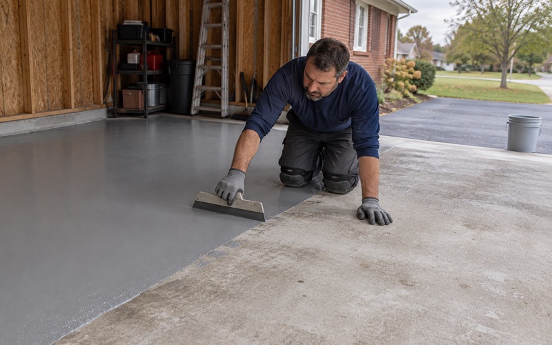
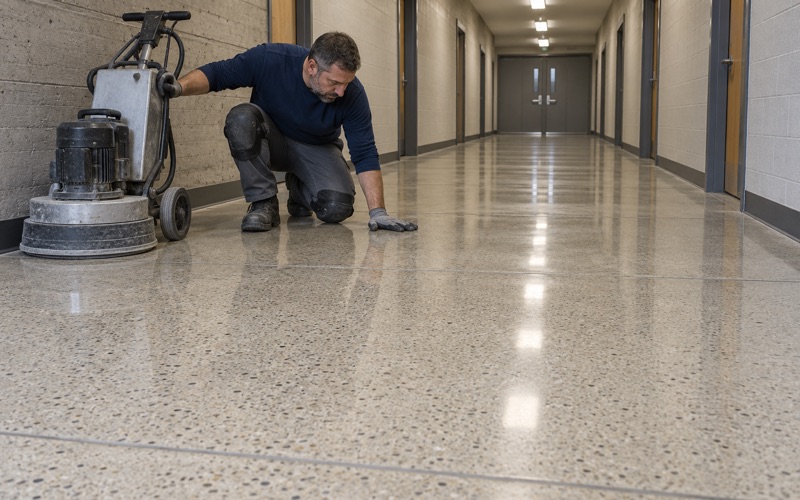
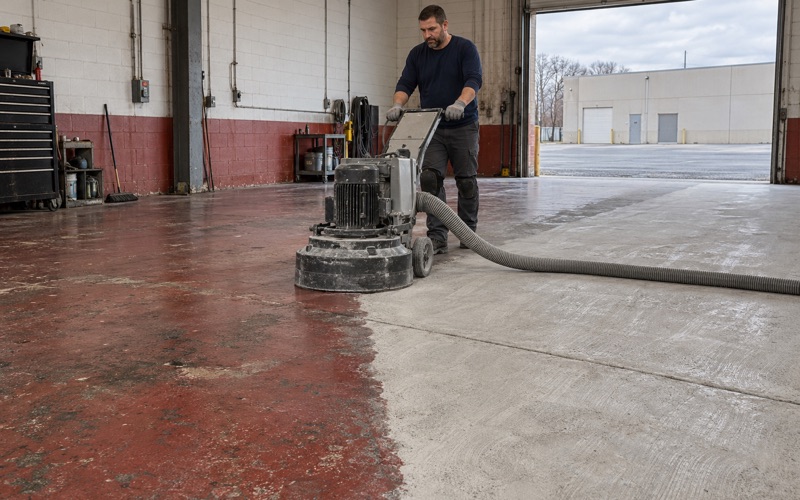
The rest of the job follows the discipline we bring to any slab. We open the concrete with a diamond grinder or shot blaster instead of an acid etch, moisture testing is written into the scope before the price is final, and the proposal names the product line, the coat count and the finished thickness so the installed floor can be checked against it.
A Memory-Care Campus on Euclid Avenue
Three levels of care at one address
Eden Vista Prospect Heights sits at 700 E. Euclid Avenue, an address that geocodes inside the City of Prospect Heights in Wheeling Township, Cook County. The operator describes three levels of care there: assisted living, memory care for Alzheimer’s disease and other forms of dementia, and skilled nursing with post-surgical, cardiac, stroke-recovery and pulmonary programs.
That mix matters to a flooring contractor because one campus can hold three very different groups of floor users. A skilled nursing hall sees wheelchairs, carts and staff moving at pace. An assisted living wing is closer to apartment life. A memory-care neighborhood is home to residents for whom the appearance of the floor itself can decide whether they keep walking down the hall.
Prospect Heights is a city rather than a village, covering about 4.29 square miles of Cook County, with a 2020 census population of 16,058. A campus like this one is a small part of that footprint, but it concentrates a kind of floor decision that most residential and commercial jobs in town never face, which is why we plan it differently.
What we know, and what we do not
We want to be plain about the limits here. We have not seen the floors at Eden Vista, we are not describing them, and nothing on this page suggests the campus is a customer. What we can say is that a building offering memory care in Prospect Heights is exactly the kind of property where the guidance below applies, and the same thinking carries to any dementia unit.
The operator describes its memory-care program as designed with safety and stimulation in mind and as a secure environment. Those are the operator’s words about its program, not ours about its floors. When we are asked to quote a coating for a setting like that, the first meeting is with the people who run the unit, not with a color chart.
Looking for epoxy-flooring closer to Schiller Park? See Epoxy-Flooring Services in Schiller Park.
Why a Dark Border Can Stop a Resident in the Corridor
Dementia design guidance from Shive-Hattery states it directly: high-contrast, dark floor colors are perceived as holes by people with dementia. A band of charcoal at a doorway, a black inlay at a corridor junction or a dark accent stripe along a wall can look to a resident like an opening in the floor rather than part of it.
How a decorative choice turns into a behavior problem
On a commercial floor, a dark border is a finishing touch. On a memory-care floor it can become a line a resident will not cross, or one they approach with visible hesitation. A resident who refuses to walk past a dark threshold may stop reaching the dining room, the activity space or their own room without help, and staff end up managing a reaction the floor created.
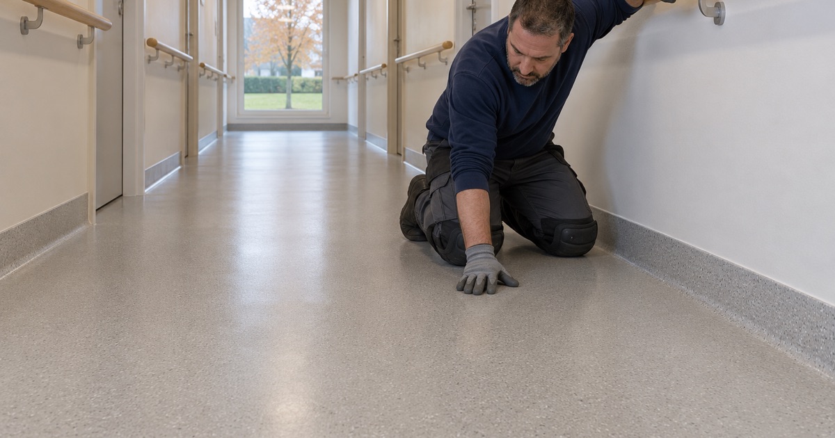
Patterns raise the same question more quietly. Strong contrast between flake colors, a checkerboard layout or sharply defined geometric shapes can read as objects lying on the floor or as changes in level. The Shive-Hattery advice is to keep flooring colors and patterns light and neutral, without high contrast, and we take that as the default starting point for any dementia unit we are asked to quote.
Guidance, not a code
It is worth being precise about the status of that advice. It is trade design guidance, not an Illinois code requirement, and we know of no state rule that dictates floor color in a care setting. That is why the decision belongs with the care team and the building owner, who know their residents, rather than with an installer choosing colors out of habit.
Choosing Color and Flake for a Dementia Unit
Most of the coating systems we install can be built light and calm. The variables are the base coat color, the broadcast and the topcoat sheen, and each one affects how a resident reads the surface underfoot. We walk the care team through all three before anything is ordered, using samples rather than catalog photos.
Base color and broadcast
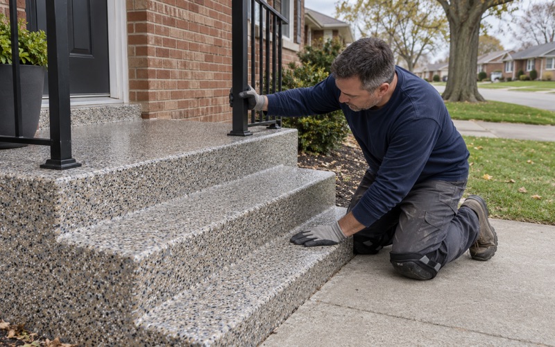
A 100% solids epoxy base in a light, warm neutral gives the floor a consistent field. If a vinyl flake broadcast is used for texture and to hide wear, we steer toward a blend whose chips sit close in tone to the base, so the floor reads as one surface rather than a scatter of dark specks. A quartz aggregate broadcast can be kept in a similarly narrow range.
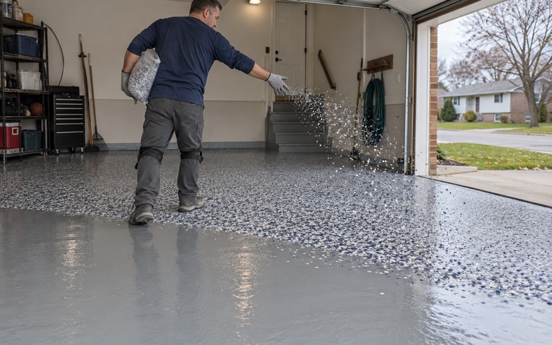
The opposite choice, a gray base under a heavy black and white flake, is popular in garages and looks crisp in photographs. In a memory-care corridor it is exactly the kind of high-contrast pattern the guidance warns against. We show care teams both options side by side under their own corridor lighting, because a chip that looks soft in daylight can look much darker under ceiling fixtures.
Seams, transitions and the topcoat
Transitions are where dark lines sneak back in. A metal threshold strip, a dark cove base or a seam where a new coating meets existing flooring can each create the very line the design is trying to avoid. We plan those junctions at the walkthrough, and where another material meets the coating we look for a transition that keeps the change in tone small.
The topcoat matters as well. A polyaspartic or polyurea topcoat over the base system can be specified at different sheen levels, and a high gloss can throw ceiling light back as a bright patch that looks like standing water. We discuss sheen with the care team as a visual decision alongside color, rather than leaving it to whatever finish a product line ships as standard.
The same thinking in a family home
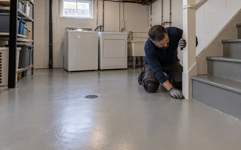
Not every person living with dementia in Prospect Heights is on a care campus. Families caring for a parent at home sometimes ask us to coat a basement family room, a mudroom or the garage floor the parent crosses to reach the car. The same light, neutral, low-contrast logic applies to those floors, scaled down to a single household and its routines.
At home, the dark line is often the edge between a coated garage floor and the house entry, or a contrasting stripe someone chose years ago. We point out those lines during the walkthrough and price a calmer option alongside the one the family first asked for, so the choice is made knowingly rather than discovered after the coating has cured.
Contrast on Purpose, Separate Wings and Questions First
When contrast is used deliberately
The same guidance that warns against dark floors also uses the effect on purpose. Shive-Hattery advises that if there is a door, piece of equipment or corridor occupants should avoid, an insert of black or intense, high-contrast color can be placed at the floor. A service door or staff-only hallway can be given a dark field so residents tend to turn away from it.
That is a decision with consequences, and we do not make it alone. The care team decides which doors residents should avoid, and the building owner approves the layout. Any insert near an exit route is also a question for the building’s life-safety planning, and the fire authority here is the Prospect Heights Fire Protection District, a separate taxing district rather than a city department.
Different wings, different floors
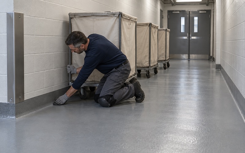
On a campus that combines levels of care, one color scheme rarely fits every wing. A skilled nursing hall may call for a surface that hides cart and wheelchair marks and cleans quickly. An assisted living wing can carry a little more color for character. The memory-care wing is where light, neutral and low contrast take priority, and the transitions between wings need their own plan.
Phasing follows the same logic. A care building cannot close, so we schedule the work wing by wing around staff routines and keep residents out of active areas. Cure windows are set by the slab temperature and dew point in each room rather than by the calendar, so a wing goes back into use when the coating is ready, not when a schedule says it should be.
What to ask the care team before any sample goes down
Before a sample board leaves our truck, we ask who the floor is for and how residents react to the floors they have now. Does anyone hesitate at a particular doorway, threshold or patterned rug, and are there doors staff want residents to avoid? Which rooms are shared and which are private? The answers shape the color plan more than any brochure does.
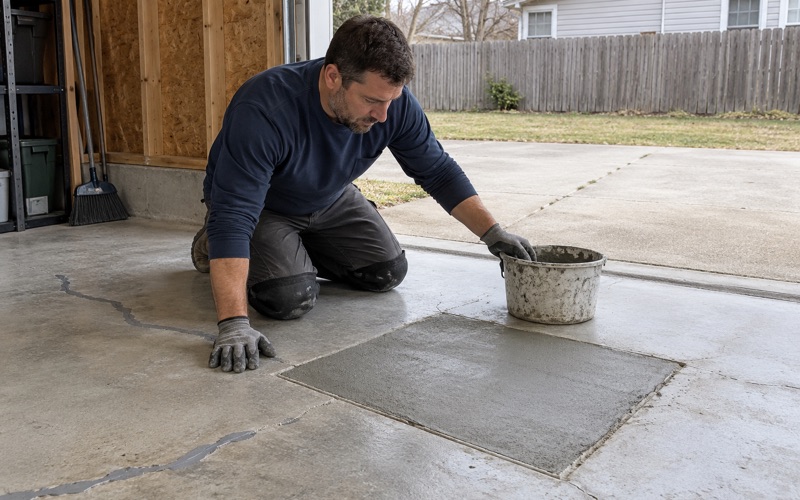
We also ask about the slab itself. Moisture testing goes into the written scope, using ASTM F2170 in-situ relative humidity probes or ASTM F1869 calcium chloride testing depending on the floor, and we map cracks, spalls and old coatings so the owner knows whether repair should come first. A pale coating shows a patched crack more plainly than a busy flake does.
Finally, the warranty terms are on the table before the job is sold. Moisture is the first exclusion we name, because a light, low-contrast floor that blisters or discolors from vapor drive defeats the reason it was chosen. With the product line, coat count and finished thickness listed in the proposal, the facility can hold the installed floor to exactly what was promised.
- 20+ Years of Floor Work
- Moisture Test in Every Scope
- Written Proposal, Named Products